"No other tool in Excel gives you the flexibility and analytical power of a pivot table"
The above quote is from Bill Jelen (a.k.a. Mr. Excel). For those of us who have upgraded to Raiser’s Edge 7.94 or 7.95, you may have noticed that Pivot Reports have changed to offer support for the full Excel pivot report but maybe not seen what that means to you.
At Productle, I often get asked to create Crystal Reports. I recently chose to create a report for a client in Pivot Reports rather than Crystal Reports as the new “Pivots” - as I call them - do some awesome things. I thought I’d share some of that with you.
First of all – what is a pivot report? It’s a way of taking the results of a Query, and then mushing it into an Excel chart or graph. You can then move elements of the chart around – like move a column to a row, or filter out an odd fund – or refresh the Query for the latest results. This article on cool stuff that Pivots can do is comprehensive. Word of warning, the article is long and gets more and more technical as you go along. Just read what you need to!
Let’s apply this to Raiser’s Edge. What we’re going to create is a table that shows income month-by-month. OK, you may have seen this before, but we’re also going to show each month in Year-To-Date form. The below steps are intended for an experienced, but not advanced Raiser’s Edge user.
Create a Gift Query. You can choose a date range, or some other filter, or you can leave that to Pivot Reports to handle later. Output Constituent ID, Fund Description, Gift Date and Amount. Check you get some results (this works best with at least two years of data) and then save the Query, taking note of the name.
Next navigate over to Reports > Pivot Reports. Create a new Report. You’ll see the simplest screen in Raiser’s Edge. Just select the Query you just created and click Generate.
If you’ve got a really big Query, you might need to wait while Pivot Reports works out every possible pre-calculation. In any case, Excel will open up with a workbook with fixed sheets: Data, Pivot Report and Graph.
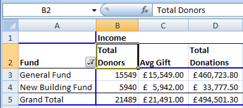
Click on the blank chart area to activate Pivots. Drag your Fund Description into Row Labels. Drag Constituent ID into the Values box.

Click on the little arrow next to Total Donors, and choose Value Field Settings….

Here, you can set the summarisation to be Sum, Count, Average and so on. Choose Count.
You can even look at the same RE value in different ways:
· Drag the Gift Amount in to Values. Repeat the Value Field Settings step to show average.
· Drag the Gift Amount over again – this time show Sum.
At this point, I start to rename the headers to phrases my team understand:
You can select ranges of cells to re-format to your heart’s content. Or to your organisation’s corporate standards at least…
Want to see these results by Month Year on Year? Sure!
Just drag Gift Date into the Row Labels. Burgh. All the dates appear! In old Pivots you were constrained in what you could group. Now, if you right-click on a date, you get custom group-by options. In this example select Months and Years.

Play around! Try the + boxes or right-click expand/ contract to show some data per year, and others per month. Be sure to name your column headers something more understandable like “year” and “month”.
To do a year-on-year comparison, drag the headers of the Month column to the left of Year. Whoosh! Suddenly, we have Year on Year comparisons.
Wouldn’t it be nice for the report to just tell me the difference year on year? This definitely requires the newly available power of full Excel. Let’s do that…
· Just drag Constituent ID in again into Values
· In Value Field Settings, let’s get funky. First summarise by Count.
· Click the Show values as tab
· Change the Show values as option from Normal to Difference From
· Select your custom Year field created earlier, and then choose a Base item of (previous)
· Click OK and your Year on Year donor comparison field appears
· You can even use Excel number or conditional formatting to highlight ups and downs.

Repeat these steps with Gift Amount (using Sum rather than Count) to see income change Year to Year.
And then Voila! An impressive report in minutes!

Close the Excel window and the Pivot Reports screen, saving the record. The next time you run the report the same Excel formatting and report construction is used, but with refreshed data from (providing you click “Refresh Pivot data on each run”).
There are lots of things you can play with such as filtering, sorting and moving columns around. I hope this encourages you to go have some fun Pivoting! Has this article set your reporting imagination off? Do email me or comment below if you have some ideas and want some tips!
Happy pivoting!
Image from WikiHow: http://www.wikihow.com/Line-Dance
An edited version of this blog has appeared on the Blackbaud website.